 There is one machine that my father would have relished explaining to Madeleine Friedli, the woman who would become my mother: The lift that carried passengers from the ground to the second stage of the Eiffel Tower. During 1937 my parents met for romantic weekends in Paris when they could scrape together the train fare. Pál came from London via the Dover-Calais ferry; Madeleine from Zurich. They made love in a left bank pension and visited the Eiffel Tower on a Sunday when lift tickets were discounted.
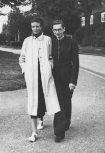
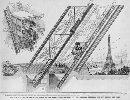 I have a photograph of them arm in arm, Madeleine, tall, elegant and self-possessed in a white trench coat. Pál, a boyish figure, seems to be trying to match her long-legged stride. They bought paper cones of hot roasted chestnuts from a street vendor on the steps of the Trocadéro. Then Pál explained the workings of the Eiffel Tower elevator, powered by a gigantic hydraulic cylinder that animated a system of cables, sheaves, and counterweights. It was part elevator, part inclined railway, since it did not rise vertically but followed the curvature of the tower’s legs. No doubt our famous relative, Uncle Dezső Korda, was mentioned as he had a hand in the elevator’s construction. Seated in the lift car, rising diagonally at a rate of 400 feet per minute, a majestic view of Paris opens up as the steel latticework of the tower’s south leg sweeps past and falls away.
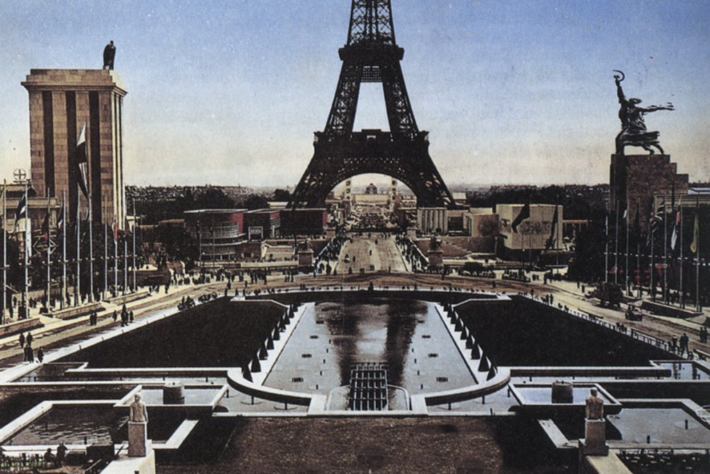
In 1937, looking northwest, across the Seine river, was a miniature city within a city, the Paris Exposition. Its full name was “The International Exposition of Art and Technology in Modern Life.” It was a world’s fair with pavilions showcasing every type of commodity and activity, the latest in technology and industry. The organizers of the Paris Expo embraced the idea that it was possible to create a model of modern and future civilization in one place and time.
For a young man trying to formulate his own unified theory of beauty and art, this had a profound resonance. My father wrote a long and detailed critique of the exposition’s pavilions and its overarching concept. Written and published in Hungarian (instead of the German he had used for school papers) it is a letter to countrymen who are unable to make the journey to Paris. In contrast to his passionate manifesto to Madeleine, his account of the Expo is circumspect and scholarly. Yet it does not hide his excitement.
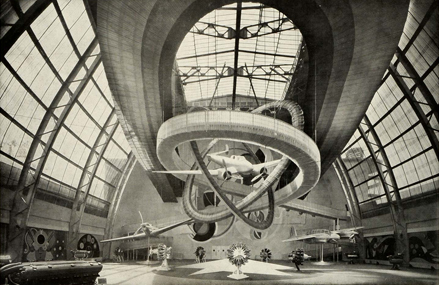
“Nowhere else does an architect have so much space to experiment with new building materials, “ he writes. “We admired colorful thermolux and vitrax glass in metal frames in the Czech architectural exhibition…” as well as the use of “fiber-cement” in the Swiss pavilion, opaline glass panels in the French pavilion of St. Gobain, and see-through rhodoid (cellulose acetate plastic) incorporated into the aeronautics pavilion.
But, stepping back to take in the whole experience, Pál observes that, instead of a world exhibition of art and technology the expo was more a commercial showcase of commodities.
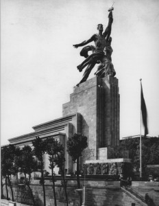
It was also an arena into which were projected the warring ideologies of the era. Two monumental buildings, the Soviet and German pavilions faced each other across the broad avenue that stretched northwest from the base of the Eiffel Tower. It appeared that principle function of the Soviet Pavilion was to serve as a plinth for a six-story statue of a male factory worker and thinly draped farm woman raising a hammer and sickle between them.
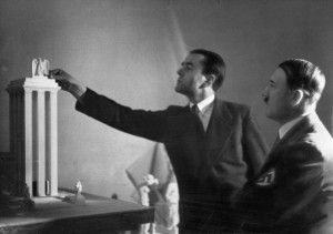
Opposite this colossus, Hitler’s architect, Albert Speer, had built a fifteen-story tower in a severe classical style, topped by an eagle on a swastika. The monumental nature of both structures was designed to frighten and belittle the onlooker and they succeeded in doing so.
What did young Pál have to say about these pavilions? Ignoring the forms as symbols of power he judged them by their functionality; the way people were led to move through the spaces. About the German building he wrote.
A tower without proportions reaches up to the sky. Inside the whole exhibition is one big room; too narrow for its height and length. It is illuminated with lamps which stand like soldiers and chandeliers that were fashionable in petit bourgeois salons twenty years ago. The objects of the exhibition are displayed in shopkeepers’ glass cases arranged in long straight lines. The dominant design is of a boring neatness and symmetry that is truly dismal.
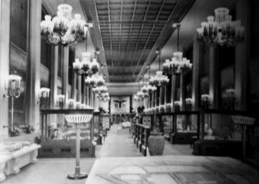
The Russian exhibition, just across the street, is also quite terrible as an architectural work. Here is chaos and confusion. The building’s front facade is as high the German tower but the structure diminishes, in stages, towards the back. This doesn’t make sense because the ceiling of the interior space rises in the opposite direction. The walls are covered with pictures, most of them quite bad. While in other pavilions the promotional effects of a few big companies give the sense of a commodities market, here in the Soviet pavilion one feels that a whole nation is being advertised.
For anyone who cared to see, the Soviet and German pavilions were the heralds, in glass and stone, of the coming World War. But war had already broken out in Spain. German warplanes sent by Hitler to support the Nationalist forces bombed the defenseless civilian population of the town of Guernica on April 26, 1937. Pablo Picasso who had been working on a mural for the Spanish Pavilion deserted his original idea and began his “Guernica,” arguably the most important artistic statement on war in the 20th century. With Picasso’s huge mural as it’s centerpiece, Spain’s pavilion became the platform for the loyalist government’s plea to the world to stand against the fascists.
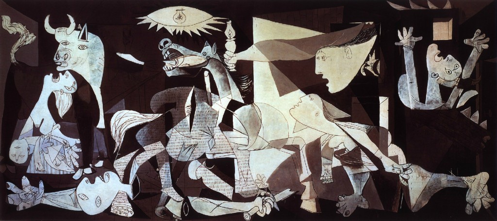
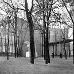
Pál liked the modernist architecture of the Spanish pavilion but mentions only the existence of “a fresco by Picasso decorating the wall in the hall of the first floor.” By contrast he is deeply intrigued by a gigantic square tent devoted to the theme of modern city planning, called the Pavillon des Temps Nouveaux, the Pavilion of New Times. The tent-pavilion was the work of the architects, Pierre Jenneret and Le Corbusier.
Le Corbusier was perhaps the most famous architect living at that time. He proclaimed that if architecture could be wrested from the styles and dictates of the past it could save the world. His book, Towards a New Architecture, was the manifesto of modernism. Like Moholy-Nagy, Le Corbusier saw the pure functionality of machines, including steamships and airplanes, as models for architecture. Hence his oft-quoted declaration: “A house is a machine for living in.”
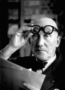
Artist, architect, city-planner, visionary and iconoclast, Le Corbusier was sometimes called “Pope Corbu.” Some felt he was a megalomaniacal crackpot. In 1932, when France announced its plan for the ’37 Expo, Le Corbusier proclaimed his intention to stage an alternative exposition, The International Exhibition of Modern Dwelling. Le Corbusier’s idea for a utopian city complex would have required the demolition of a vast part of historical Paris. Two years later, after support for this scheme failed to materialize, the architect received conditional approval from the Exposition for an experimental apartment building that would house 9,360 inhabitants in a steel and concrete slab half a mile long and fifteen stories high. When building industry financiers were indifferent, Le Corbusier wooed them with a more modest plan for a “Cartesian” skyscraper for a mere 4,000 dwellers. Again backers were unmoved.
It’s a measure of Le Corbusier’s status among modernists that the Exposition’s planners, instead of cutting him loose, offered him 500,000 Francs to build a modest, temporary building for the exhibition. After months of jockeying for a more lasting edifice and a bigger budget, Le Corbusier finally accepted his partner Pierre Jenneret’s more realistic proposal for a large building with canvas walls. Inside would be what Le Corbusier called “une grand livre des images” (a big book of images) – pictures, plans, blueprints, and text that promoted the architect’s vision of the utopian city of the future.
Pál wrote about it.
The building is ideal for an exhibition like this. It is light, economical, and easy to install and disassemble. The first impression a visitor gets is of spaciousness. Light filters through the canvas walls. The shadows of trees surrounding the tent animate the space. One does not feel cut off from the outside world.
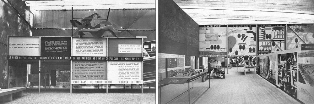
Here Le Corbusier lays out the four functions of city planning “Habitation, Transportation, Work, Leisure” in a convincing way. Going up a ramp one passes images and blueprints offering solutions. The visitor can see both the plans and the finished works of Le Corbusier and his colleagues as well as the results of analytical work on cities around the world. As we ascend the ramp we are drawn more deeply into these topics. There’s a clever correlation between one’s position on the ramp and one’s depth of exposure and understanding. The blueprints, models and montages are presented with the precision and beauty Le Corbusier is known for.
Pál was less impressed by the ideological content of Le Corbusier’s big book of images which he called “obviously utopian, mistaken and full of false economic arguments.” Little did he suspect that within a few months he would be working for Pope Corbu in his atelier at 35 rue Sevres.
© COPYRIGHT, 2015 MOIRA PRODUCTIONS. ALL RIGHTS RESERVED
Judith A Berlowitz
September 2, 2024 at 7:19 pmHello from San Francisco. For a biographical novel about Richard Bransten, I would like to include the image of the 1937 Soviet Pavilion. Are there copyright restrictions in my way of reproducing the photo included in this article?
Thanks in advance for your reply.
Summer Brenner
February 14, 2022 at 11:22 amJust getting around to reading these great anecdotes and seeing the pictures from the PARIS EXPO, especially the dueling monstrosities of Germany and the USSR.
I visited the Brussels World’s Fair when I was 12, and I remember the USSR pavilion stuffed with exhibits of machines and fur. Magical to me was the Thai pavilion: https://en.wikipedia.org/wiki/Expo_58#/media/File:Expo58_building_Thailand_B.jpg